The core intention of creating this app is to make health a priority. While we use a hundred of apps to kill time. It's a little effort to save lives on time and ensure a healthy lifestyle. This project addresses the problem of shortage of applications of focusing on a person’s health with daily activity tracking, reminders for medical prescriptions and having a hospital account in one place. This data will then help in the early diagnosis of potential medical conditions, as well as assist scientific researchers understanding of existing medical conditions through the participation in medical research that this application offers.


Design Process

Research
Competitive analysis
The research took as its starting point a review of the main competitors. However, there is no platform which covers all these functions in one application, so the three best applications from the different areas of the project which were:
Apple HealthApp, HealthSteps and MyHeart Counts were chosen and their key features of UI, UX, user flow were studied.In addition, it was discovered that Health App from Apple was the closest to the Sehar Health application because it gathers all health-related information in one place, which was convenient for users and helps them to be on track with valuable information.
Survey
Through collecting all information from the survey and existing research had revealed several types of users with diverse needs which were combined in two personas that manifest needs and weak points of the existing applications.
Problems
Lack of Transparency: Patients and doctors often lack access to transparent health and fitness records. Patients may not maintain a comprehensive health log, and they may forget or be unable to carry all relevant documents when visiting a doctor. This lack of transparency can lead to incorrect diagnoses and ineffective treatments.
Neglecting Follow-Up Checkups: Many patients do not prioritize follow-up checkups, which are crucial for monitoring and managing their health conditions effectively.
Ignoring Symptoms: Patients frequently disregard or downplay symptoms and may postpone or avoid visiting a doctor, potentially worsening their health issues.
Absence of Health and Fitness Guidance: Patients often lack proper guidance for maintaining their health and fitness on a daily basis. This absence of guidance makes it challenging for doctors to offer ongoing support and recommendations.
Inadequate Doctor-Patient Communication: Effective communication between doctors and patients is often lacking, hindering the exchange of essential information and advice necessary for managing one's health effectively.
These points succinctly capture the key challenges identified during our user research.
Goals and objective
Core Features
Comprehensive Health History: Users will have access to a hands-free, transparent doctor appointment, enabling healthcare providers to view fitness habits, health goals, and a complete patient history. This feature ensures that doctors are well-informed about their patients' health backgrounds.
Effortless Appointment Booking: Patients can book live or in-person appointments quickly with just two clicks, ensuring a seamless and convenient scheduling process.
Real-time Health Alerts: The doctor's app will send notifications whenever there is a red flag in the patient's health profile, allowing for timely intervention and monitoring of critical health issues.
Personalised Healthcare and Lifestyle Plans: Leveraging AI, the app will generate customised, interactive healthcare plans and lifestyle recommendations for users. These plans will be prominently displayed on the app's home page, helping users make informed decisions and work towards their health and fitness goals.
Structure Overview
This stage aimed to organize research findings and create a basic digital flowchart, providing a clear path for users through the solution. The initial flow was sketched on paper and later digitized, guiding the development process.

AI Powered Home Screen

Affinity Map

User Personas
We developed distinct user personas to better understand Sehar Health's diverse user base. To ensure a personalized experience that caters to the unique fitness goals of these user personas, the home screen has been designed to adapt based on individual user profiles.
Here's how the home screen will differ for each identified user persona:
Here's how the home screen will differ for each identified user persona:
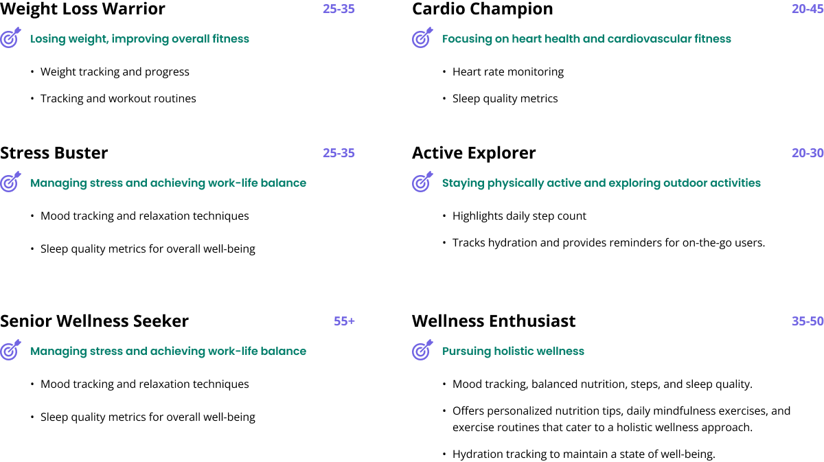
A peak into user persona
Information Hierarchy
This stage aimed to organize research findings and create a basic digital flowchart, providing a clear path for users through the solution. The initial flow was sketched on paper and later digitized, guiding the development process.

Xfn Collaboration
The success of the Sehar Health AI-Powered Wellness Journal doesn't rely solely on innovative design concepts.
Let's explore how development collaboration, following the information architecture and ideation phases, has contributed to the realization of our vision.
Briefly recap the project's objectives, user personas, and the design concepts developed during the ideation phase.
Feasibility Assessment: After a productive ideation phase, the development team played a vital role in assessing the feasibility of our design concepts.We engaged in discussions to understand the technical implications of our creative ideas.
Technical Insights: Collaboration with our developers provided us with valuable technical insights.They offered suggestions on tools, frameworks, and technologies that could enhance the user experience and streamline the development process.
Early Alignment: Our collaboration ensured early alignment between the design and development teams.This proactive approach prevented potential roadblocks and design changes later in the project, ultimately saving time and resources.
Problem-Solving: Collaboration between our designers and developers fostered a collaborative problem-solving mindset.Together, we tackled technical challenges, identified solutions, and ensured a practical, user-friendly design.
Outcome:
As a result of our development collaboration, we achieved a seamless transition from design concepts to a fully functional product.
This Wellness journal was not only visually compelling but also technically sound and user-centric.
Sketching and Ideation

Wireframes

Prototyping
Users were able to navigate the home screen and understand how it adapts to their needs.
Also, on this stage of the project, the interactive prototype was created in order to test the usability and logic of the application.
Testing
This approach allowed us to fine-tune and optimize the home screen design by comparing two or more versions with real users, gaining invaluable insights into what truly resonates with our diverse user personas. We used Userbrain to test our figma prototypes..
The Challenge
Sehar Health's user base spans a wide range of fitness goals and age groups.
The home screen design needs to be adaptable to cater to each user persona.
We aimed to ensure that our design decisions were based on data-driven insights, fostering a user-centric approach.
Methodology
Variant Creation: We created multiple variants of the home screen design, each tailored to a specific user persona (e.g., Weight Loss Warrior, Cardio Champion, etc.).
User Segmentation: Real users from each persona group were identified and recruited to participate in the A/B testing.
Random Assignment: Users were randomly assigned to one of the design variants, ensuring a fair comparison.
Usage and Engagement Analysis: We closely monitored user interactions with the home screen, including click-through rates, time spent, and goal achievement.Feedback Collection: We encouraged users to provide feedback on their experience and preferences regarding the home screen design.
Insights and Outcomes
A/B testing revealed that tailoring the design to each user persona led to improved user satisfaction and a design that resonated with the diverse needs of our user base.
The Impact
Positive user feedback and higher user satisfaction. And enhanced goal achievement and user-centric design decisions.
Mood Board

Style Guide

Design Components
Atomic principles were used in order to create all components of the project which could be used in the future development of the project like websites, new sections of the application or printable. For the majority of elements were created different stages like active, inactive or disabled.

Daily Activities
In a few simple clicks, weight or heart rate can be added: all other information would be automatically transferred from a user’s phone.

User Education and Onboarding

Conclusion
I've learned that designing the app has been both challenging and rewarding. Through this project, I've come to understand the critical importance of the research stage. It's particularly challenging to create a product for two distinct user groups: active users who use the application daily and passive users who analyze data and require different types of treatments. The project's relevance and true value for users only became evident after conducting thorough medical research and surveys.
Improve user flow
Develop the product scaling plan (web version)
Drop me a line or give me a call
